These posters were a project for my silkscreening class. We could pretty much do anything we wanted as long as it used at least 4 layers. I had been thinking of doing something using the sculpture from in front of the Erie Art Museum for a while, so I combined that image with the phrase "Keep Erie Weird". The first poster is with 4 layers, and the second one only has 3. I kind of prefer the second one.
This is what evolved from my previous post. I used a mixture of stencils, paintmarker, typography, and some screenprinting (or my version of it). I was getting mixed messages from the class critiques, so I tried taking a little bit of what was said each week. Worked my butt off but my teachers hated each version I did. Not everyone is going to love everything you make though.
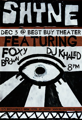
I've been working on rebranding a rapper named Shyne for my Typography class for the last couple of weeks. I'm still tweeking the logo, but I just finished some roughs of gig posters inspired by a graffiti artist from Trinidad. I'll post the finished products when I'm done.
Some ads for an upscale umbrella company. It was an assignment for my graphic design for advertising class.
I was looking thru some of the files on my laptop and came across some old work I had done for a friend's band. This was in the summer of 2008. I did some promo photos and designed their album cover.
For my screen printing class we were told to make a print that was "us". I came up with this poster. I feel like it is a pretty good representation of the way I design and also a little bit of my personality. I've been called a space cadet by my friends many times so I incorporated someone on the moon, and the circle that says "square" is representative of my sense of humor. I tend to like things that are a little weird. If you look at the letters you can find the letters of my last name. Along the side was the date I came up with the design.
I had some time to kill in Manhattan today so I sat down in Union Square and people watched for a while. There were a bunch of old men playing chess and I couldn't help but draw them. I've been sketching a lot on the subway too. People napping are my favorite.
Over the summer I interned at PAPA Advertising in Erie, PA. The banners and coolers were for Erie's Blues and Jazz Festival. PAPA is one of the sponsors.
The images below were for their new website.
You can check them out on their website: http://www.papatestsite.com/new/interactive/
Today I was working on a victorian portrait for a project and my teacher said it wasn't big enough. I was about halfway done and I liked how it looked so I figured I'd do something weird with it.
Our class was asked to design a poster for Clinton NY's 5th Annual Art and Music Festival. I came up with an image that could be used in several different ways and applied it to a tee and some different types of paper. Above are some of the applications and my preliminary sketches. They said they would be using the one they liked the most. Crossing my fingers...
This is an illustration I did for my children's book assignment.
I chose to illustrate a quote from Aesop's The Bald Man and the Fly.
I chose to illustrate a quote from Aesop's The Bald Man and the Fly.
Starting to use watercolor in illustration now. Had some blue left over after doing a study in class so I thought I'd try and do something with it.
These were just of my wall, I'll put more up later of the other walls and the installation we hung from the ceiling.
This is a poster I designed for the show my roommates and I are having. I used a font called "THESORDEN" and did a collage using pictures of the four of us. The eyes are mine.
A lot of the pieces in the show are on this blog, so that can give you a little bit of an idea what it'll look like. I hope it goes well...
Been cranking out a lot of pieces lately, did this one about and hour ago. Something I've been trying recently is going on creative commons and finding old photos and then trying to do something based off of them.
Subscribe to:
Posts (Atom)


