A friend of the family asked if I would do some portraits of her daughters. I used a micron pen and some india ink. I'm really happy with how they turned out. It was kinda nice having a project that wasn't design related.
I've been working on my website for the last couple days. I'm really starting to like it, especially the splash page (see above). You can check it out for yourself at http://cargocollective.com/annalindelldesign
I'll have more on there soon, most likely over Thanksgiving break. Have a happy holiday!
Finally got around to make a logo/identity for myself. I wanted it to show the illustrative nature of my work and a little of my personality. After trying several different ideas I realized that my handwriting is unique to me and wrote my last name on a sheet of paper until I found one I liked.
I'm currently working on an annual report for a client and don't have all the info quite yet so I have been playing around with theme and layout. Thought I'd show one of the fake spreads and the scans I used to make it.
It's been a while since I posted any logos on here. This is one I did recently for a made up company called "Anchor Accessibility Inc." The company specialized in making products to adapt everyday things for disabled people. I chose the name "anchor" because in the definition it says: "apersonorthingthatcanbereliedonforsupport,stability, orsecurity;mainstay:" I felt this went perfectly with the idea of the company. The logo is both literal and funny, showing the anchor having a hand attached as if it were an amputee, but it is still done in a way that is classy.
Thought I'd post something showing my process this time. I'm working on a series of promotional pieces for a cardboard boat regatta that goes on in Erie. I really like the idea of incorporating the idea of cardboard in an unconventional way. So I thought why not make the logo look like old sailor tattoos, but use cardboard as the banner. To get the banner to look right I had to do a bunch of studies of strips of cardboard folded in different ways. It was really fun other than the fact that cardboard doesn't hold it's shape very well when you fold it. I eventually had to tape in down to my desk.
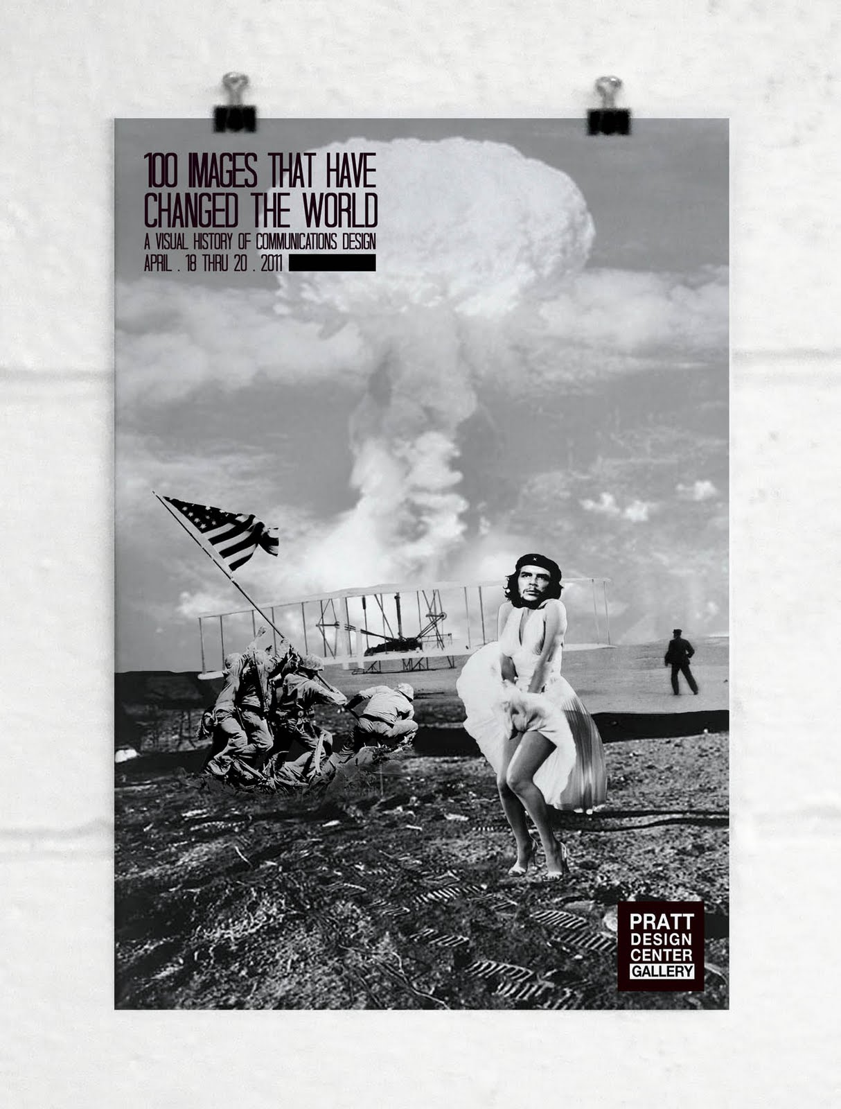
My first attempt at the poster didn't go too well. Too generic, kinda figured that would happen. So for this one I put a little more Anna into it, and it turned out a billion times better in my opinion. My teacher loved it. I guess being true to yourself goes for when you're designing too.