ANCHOR

It's been a while since I posted any logos on here. This is one I did recently for a made up company called "Anchor Accessibility Inc." The company specialized in making products to adapt everyday things for disabled people. I chose the name "anchor" because in the definition it says:
"a person or thing that can be relied on for support, stability, or security; mainstay:"  
I felt this went perfectly with the idea of the company. The logo is both literal and funny, showing the anchor having a hand attached as if it were an amputee, but it is still done in a way that is classy. 


Cardboard Regatta Logo

Thought I'd post something showing my process this time. I'm working on a series of promotional pieces for a cardboard boat regatta that goes on in Erie. I really like the idea of incorporating the idea of cardboard in an unconventional way. So I thought why not make the logo look like old sailor tattoos, but use cardboard as the banner. To get the banner to look right I had to do a bunch of studies of strips of cardboard folded in different ways. It was really fun other than the fact that cardboard doesn't hold it's shape very well when you fold it. I eventually had to tape in down to my desk.


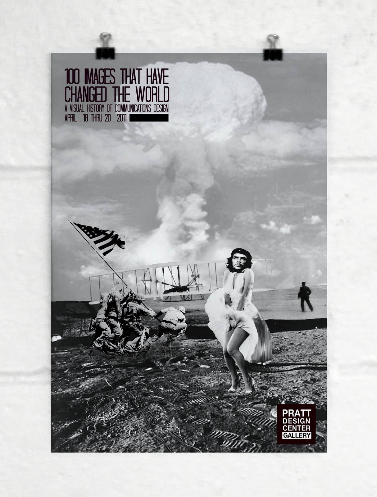
100 IMAGES POSTER 2.0

My first attempt at the poster didn't go too well. Too generic, kinda figured that would happen. So for this one I put a little more Anna into it, and it turned out a billion times better in my opinion. My teacher loved it. I guess being true to yourself goes for when you're designing too.

100 Images poster

This is a rough idea for a poster for a possible exhibition at Pratt that would feature "100 Images That Have Changed the World".


Found out my type book from last year was featured on Helvetica Lover. So cool.
http://www.helveticalover.com/post/1320324480/type-specimen-book-helvetica-neue-by-anna


Book cover

Finally finishing some projects so I have stuff to post. Recently did a book cover redesign for the novel "Forever" by Pete Hamill. The basis of the story is that there is this guy that lives in Ireland in the 1700s and immigrates to Manhattan. He is given the gift of living forever by an africa priestess, but the catch is he can't leave the island of Manhattan. The story covers the history of the city from the 1700s to around 9/11. I tried to juxtapose old and new by using an old background with a more modern typeface. Also I used 3 symbols that I thought accurately summed up the main character's journey. The symbols all represent a mode of transportation but also have a second meaning, for example the plane symbolizes modern transportation and also symbolizes the events of 9/11 which are mentioned in the story.


sketchbook


weird


These posters were a project for my silkscreening class. We could pretty much do anything we wanted as long as it used at least 4 layers. I had been thinking of doing something using the sculpture from in front of the Erie Art Museum for a while, so I combined that image with the phrase "Keep Erie Weird".  The first poster is with 4 layers, and the second one only has 3. I kind of prefer the second one.